Choosing the right colors for your home goes beyond creating aesthetic appeal. It is about shaping an environment that nurtures your emotional wellness every day. Your surroundings can subtly influence mood and behavior, shaping your comfort and contentment. For those looking to enhance their living spaces, working with professionals like Bates Painting ensures that your color choices not only look beautiful but also enhance your home’s ambiance.
Colors have the remarkable ability to evoke specific feelings, from calm and serenity to inspiration and energy. By understanding how hues affect you psychologically, you can make more strategic design decisions, giving every space in your home a purpose and a distinct emotional character.
Contents
Understanding Color Psychology in Interior Design
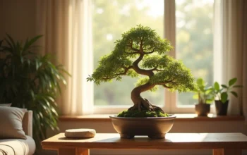
Color psychology examines how colors affect human behaviors and emotions. Research shows that color frequencies interact with the brain to trigger particular responses. Blues and greens often call up a sense of tranquility, while reds and yellows bring stimulation and vibrancy. Knowing these associations allows you to customize each room’s feeling according to how you want to use it, whether for relaxation, creativity, or socializing.
Psychological responses aren’t universal, but several trends hold across cultures and contexts. For example, blue is broadly associated with calm and trust. Red is known to increase heart rates and evoke passion or excitement, making it invigorating but potentially overwhelming if overused.
To dive deeper into the subject, this WebMD article explores how color choices influence feelings and productivity.
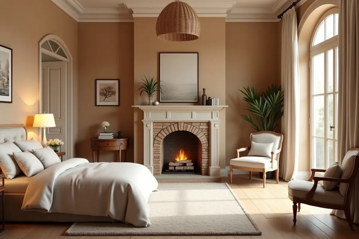
Best Colors for Relaxing Bedrooms
Your bedroom should be an oasis from daily stress. Cool, subdued colors such as pale blue, soft green, and gentle lavender have been scientifically shown to encourage calm, restful sleep. These hues mimic the calming elements of nature, such as open skies and quiet meadows. Applying these tones to walls, linens, or decorative elements can transform your bedroom into a soothing haven.
Implementing Tranquility
Start with a muted palette for large surfaces, like walls or curtains, and layer in deeper shades or complementary neutrals for depth. Avoid highly saturated colors or busy patterns in areas dedicated to sleep, since visual calmness promotes a sense of retreat and relaxation.
Energizing Colors for Living Rooms and Kitchens
Rooms that serve as the hub of your home, such as living rooms and kitchens, are best energized with warm shades. Accents of red, orange, or yellow can increase vitality and encourage sociability. These hues are ideal for infusing communal settings with a sense of joy and movement. Introduce them through statement walls, upholstered chairs, or bold decor to make the room feel lively and inviting.
Even small pops of energetic color in accessories or artwork can uplift the room’s atmosphere, making guests feel welcomed and conversations more spirited. For more ideas on color choices for different rooms, see Architectural Digest’s guide on creating a color palette for your whole home.
How Warm and Cool Colors Affect Mood
Recognizing the emotional impact of the color temperature spectrum is crucial in designing a harmonious home. Warm colors such as reds, oranges, and yellows are linked to stimulation, warmth, and excitement. These tones work well in playrooms, kitchens, and busy spaces. In contrast, cool colors like blue, green, and purple have a calming effect, making them perfect for spaces where relaxation or concentration is the priority.
Balancing these color temperatures across your home helps create distinct emotional environments that support the various functions of each space, from focus and productivity to unwinding at the end of the day.
Using Neutral Colors for Balanced Interiors
Neutral shades, such as white, beige, taupe, and gray, are valuable for creating visual breathing room and enhancing other colors. They promote simplicity and clarity in interior design, allowing bold accents to take center stage without competing for attention. Neutrals also help rooms feel more spacious and organized, reducing visual clutter and stress. Layering textures and subtle variations of neutral tones can add sophistication and prevent spaces from feeling too stark or cold.
Mistakes to Avoid When Using Bold Colors
Bold colors lend a sense of vibrancy and excitement, but using them thoughtfully is key. Overwhelming a space with a single bright hue can lead to discomfort or restlessness. Instead, use bold tones as accent walls, pillows, or statement decor pieces. Always consider the natural light and the room’s square footage, as dark or saturated hues in small or poorly lit spaces may feel oppressive. Testing color samples at home in different lighting conditions before fully committing can help avoid costly or disappointing results.
Conclusion
Thoughtful color selection can transform your home’s mood and functionality. Harnessing the principles of color psychology enables you to create spaces that not only look beautiful but also actively support your emotional well-being. Whether you aim to build a calm bedroom escape or an energizing kitchen hub, strategic color choices can remarkably elevate your daily living experience. For optimal results and expert insight, collaborating with specialists from companies like Bates Painting can make your vision a seamless reality.